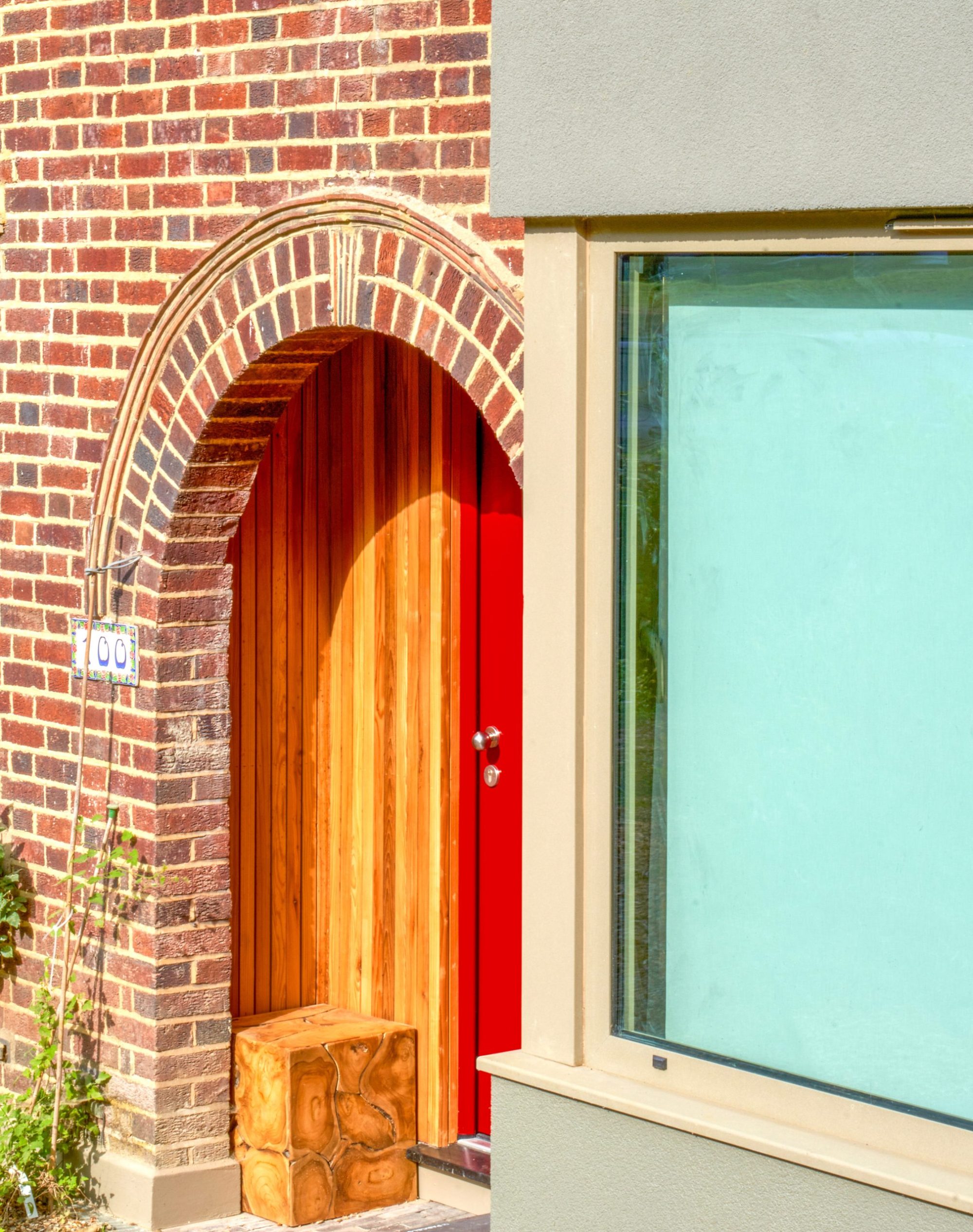
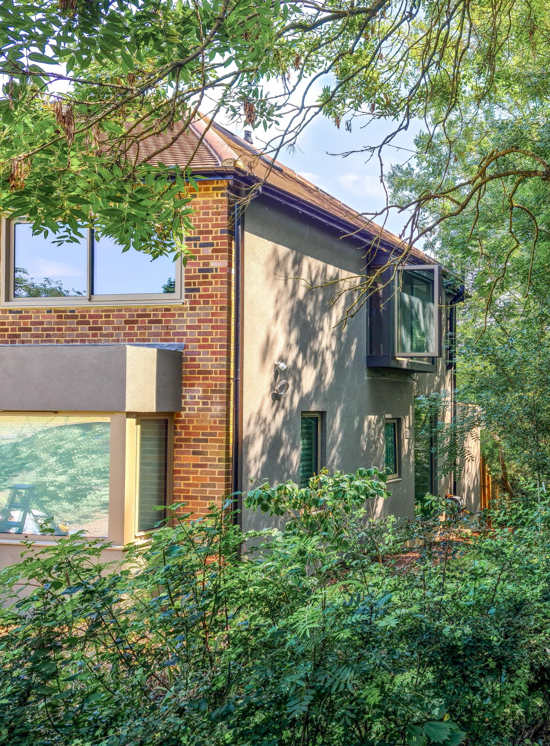
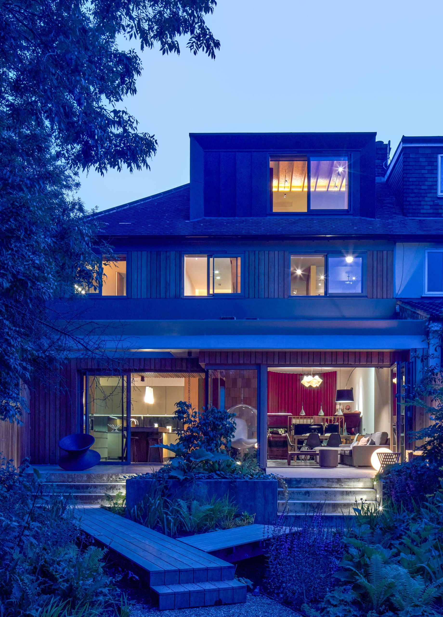
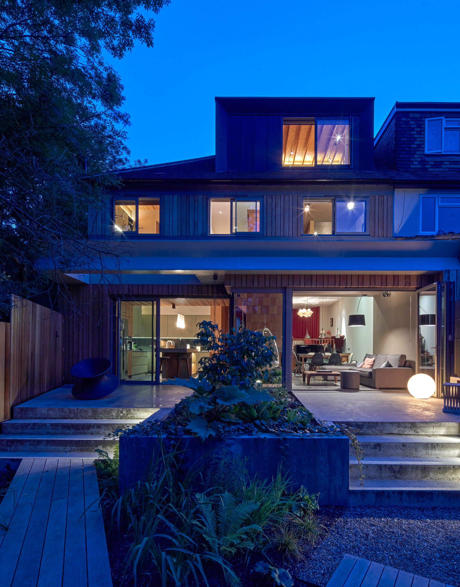
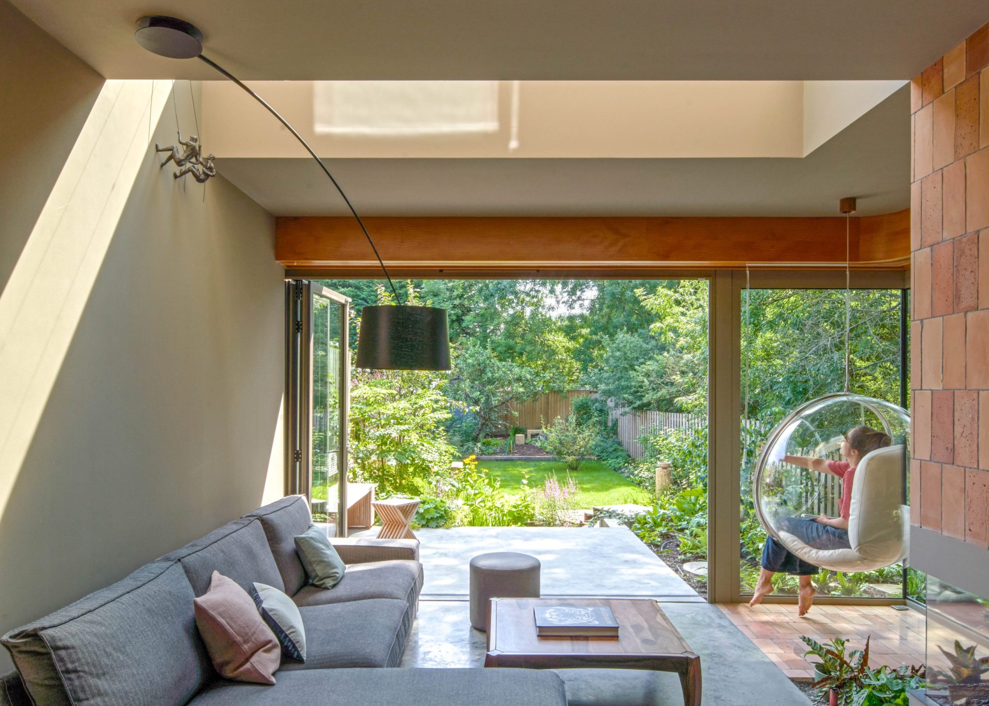
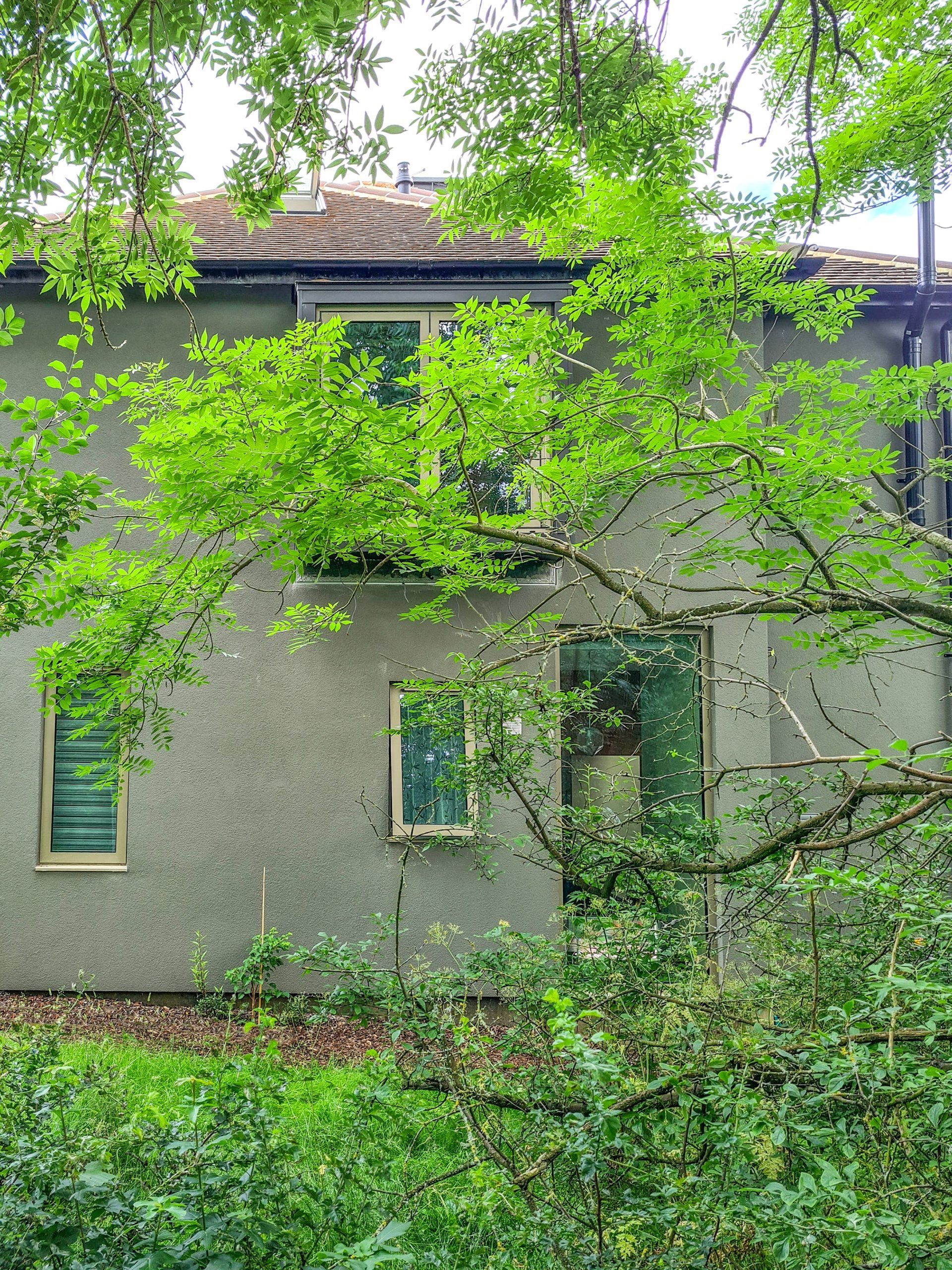
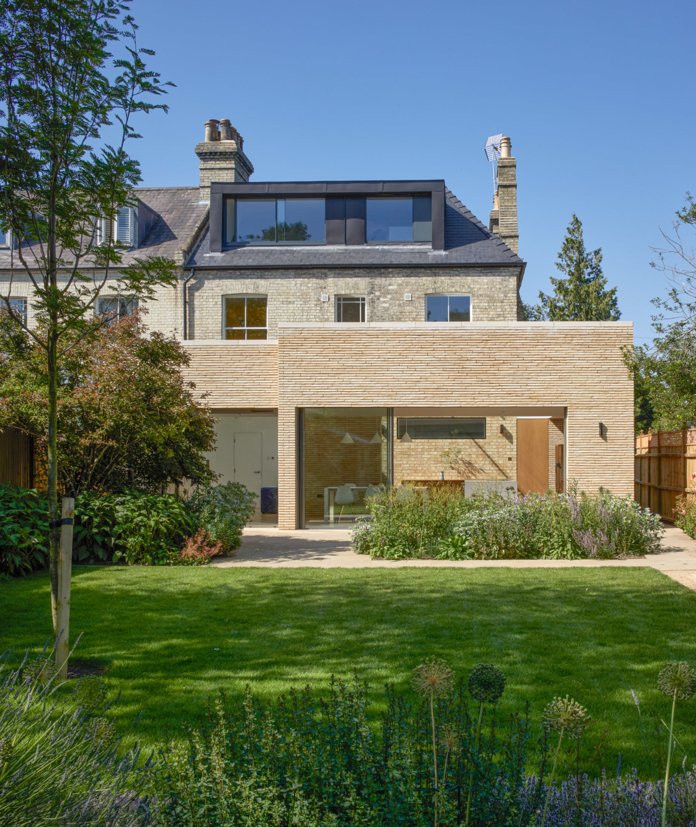
The home is conceived as a yoga mat, a grounding space that provides a sense of relief from the unpredictability of the outside world. The design moves are intended to focus the occupants’ attention on the natural world: the rhythms of the sun, the change of seasons and the textures of natural materials. The home is surrounded by greenery and extended views toward parkland that links into King George’s Fields nearby. A path meanders through a landscaped front garden and from the front door there is a clear view through to the verdant rear garden.
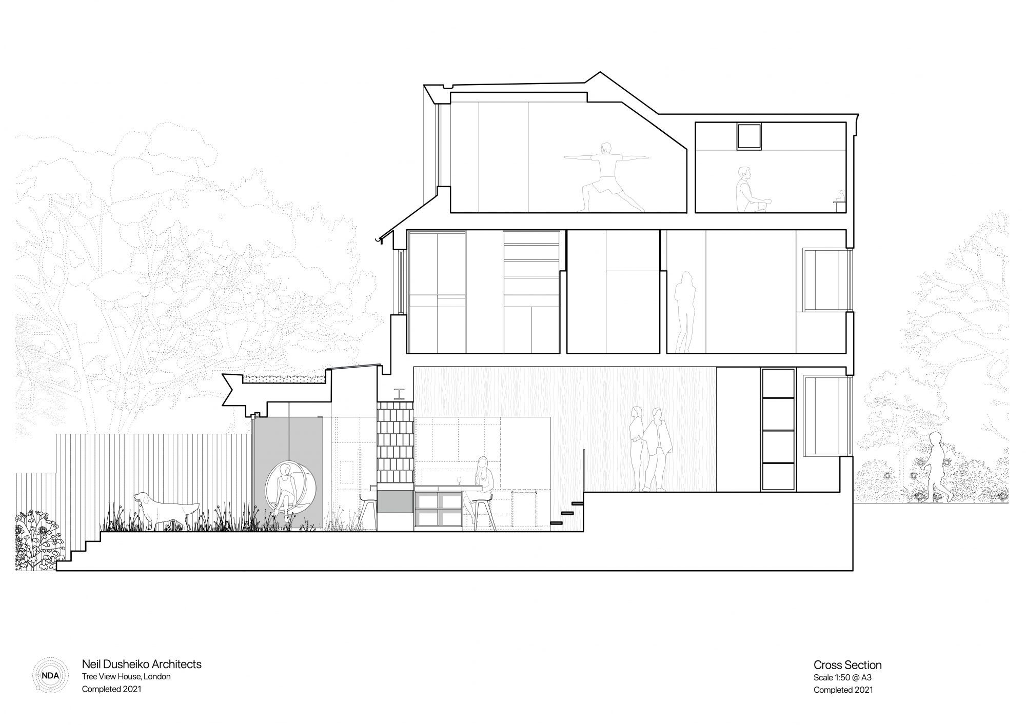
The home is subdivided into three-bays to help organize the spaces and create a balance between spaces for rest and activity. On the ground floor the plan has also been manipulated to smooth the transition in levels from the street to the garden. The entry is at the highest point, flanked by an office and formal sitting room, a short flight of stairs leads to a living area and garden rooms.
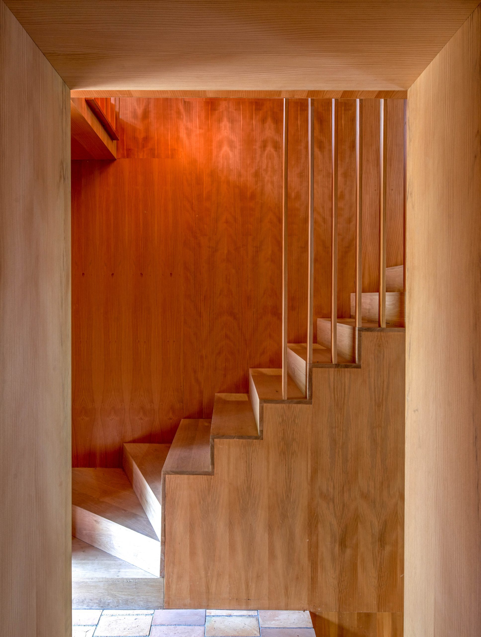
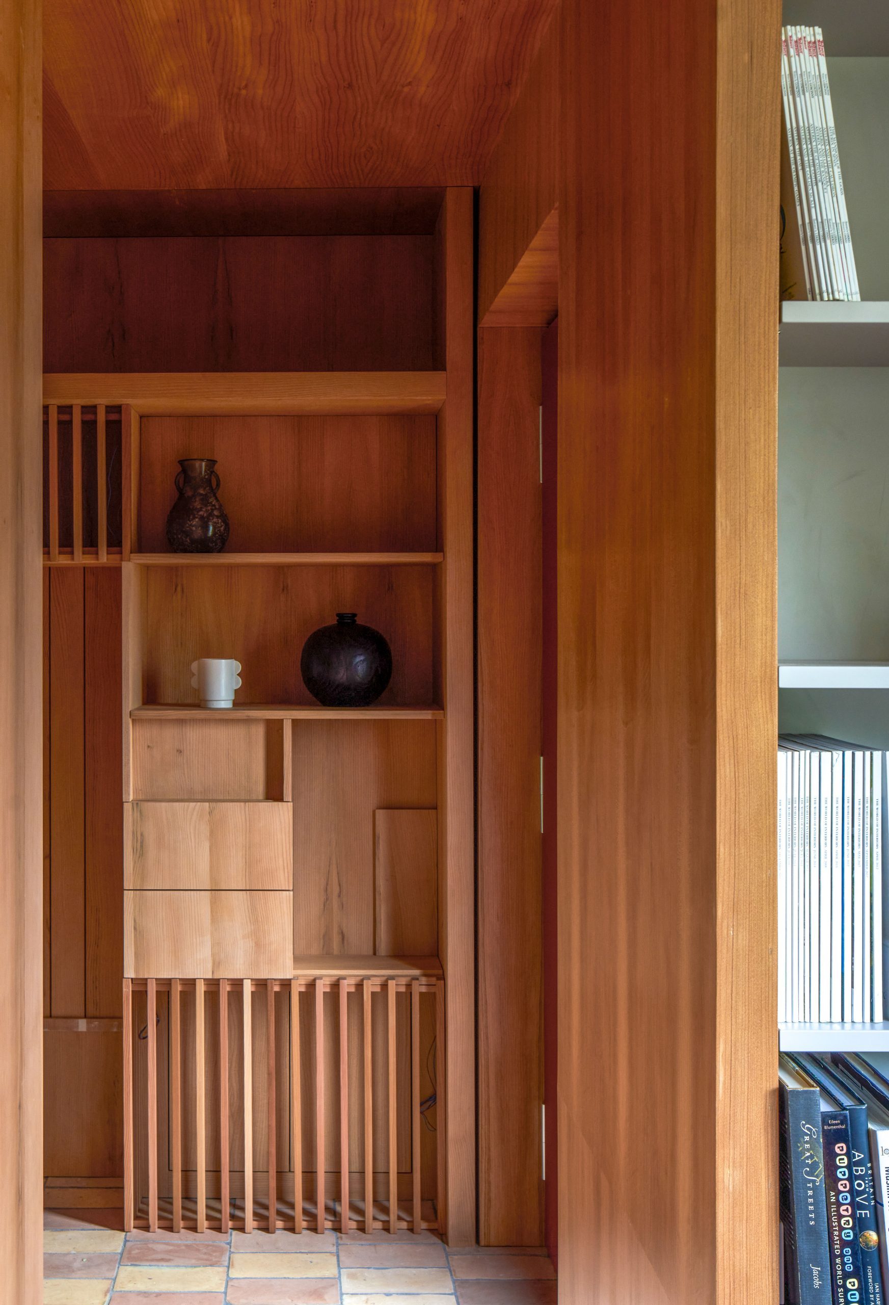
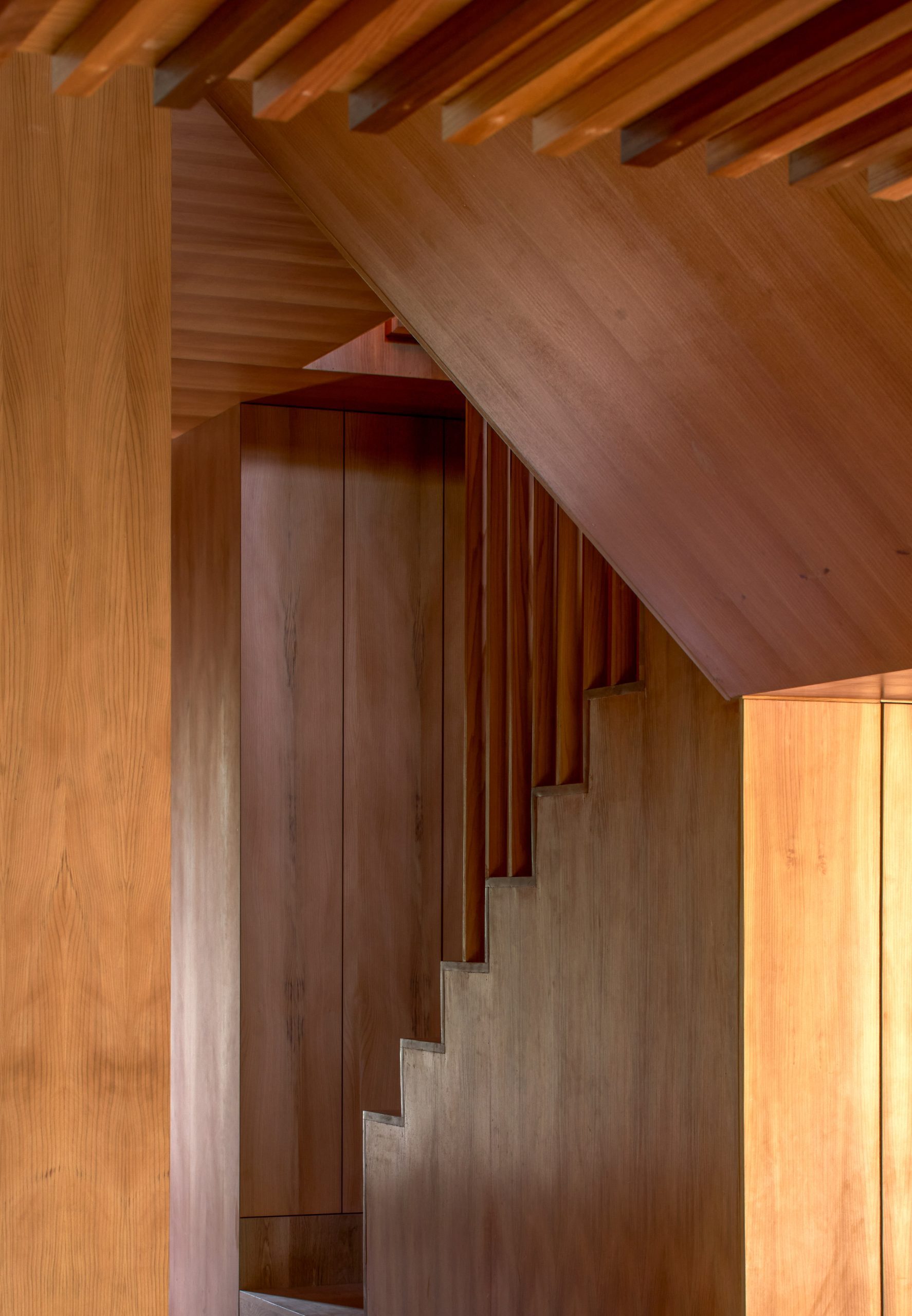
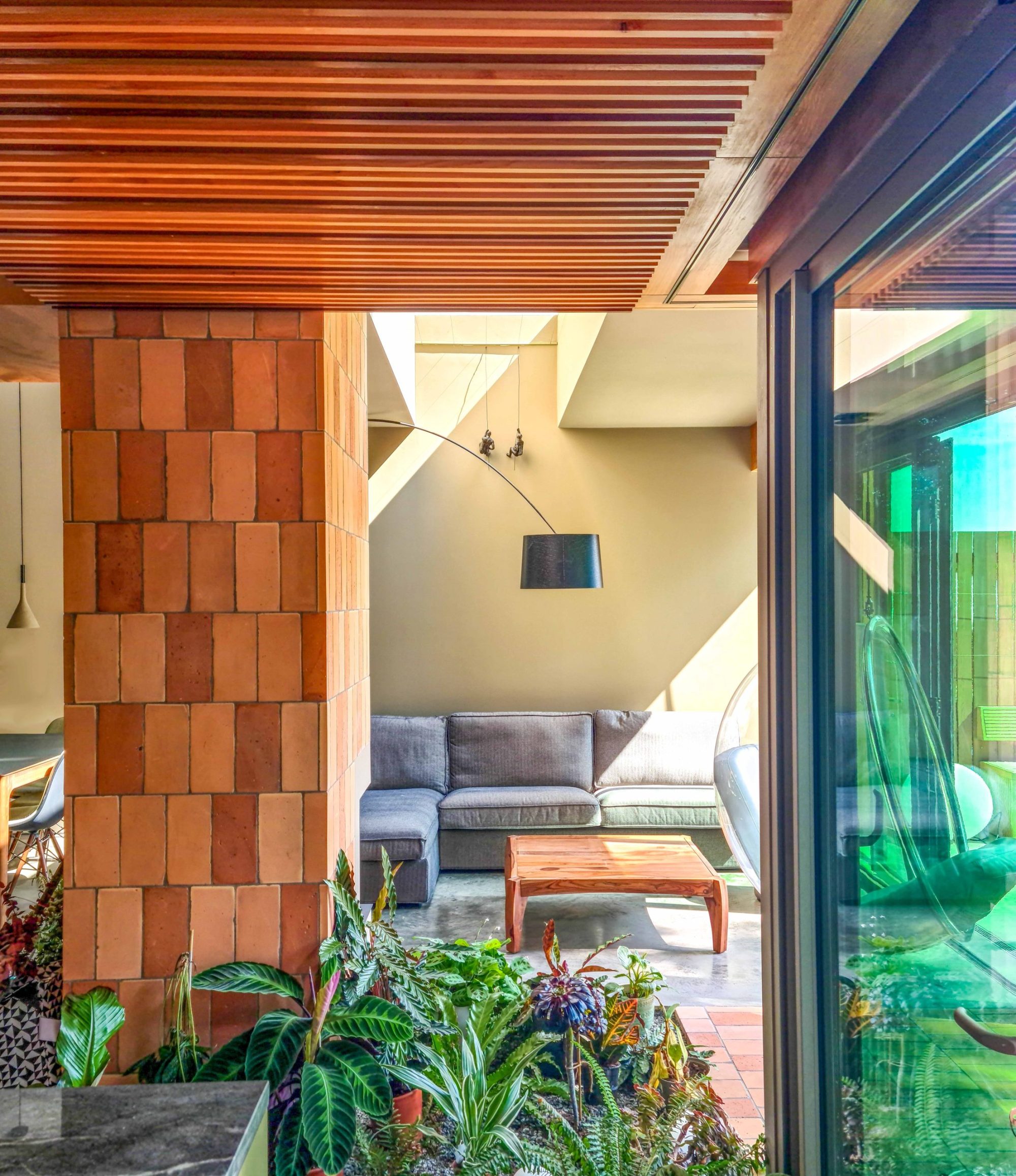
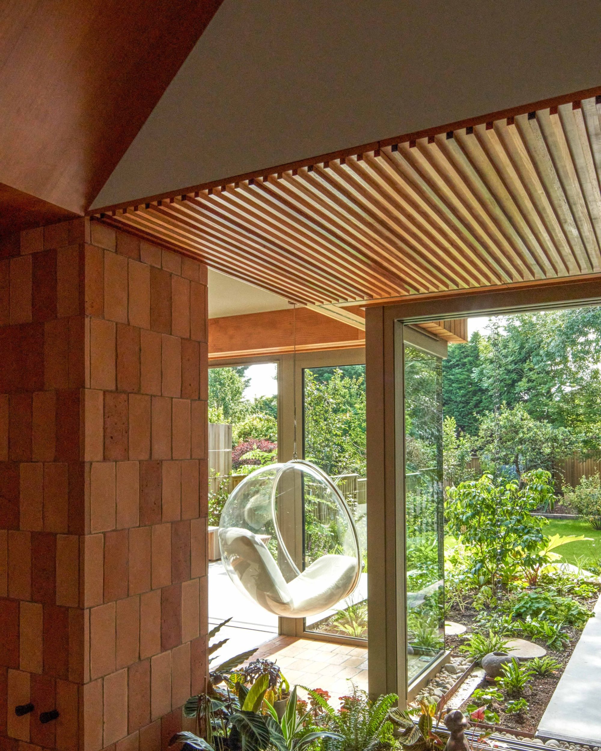
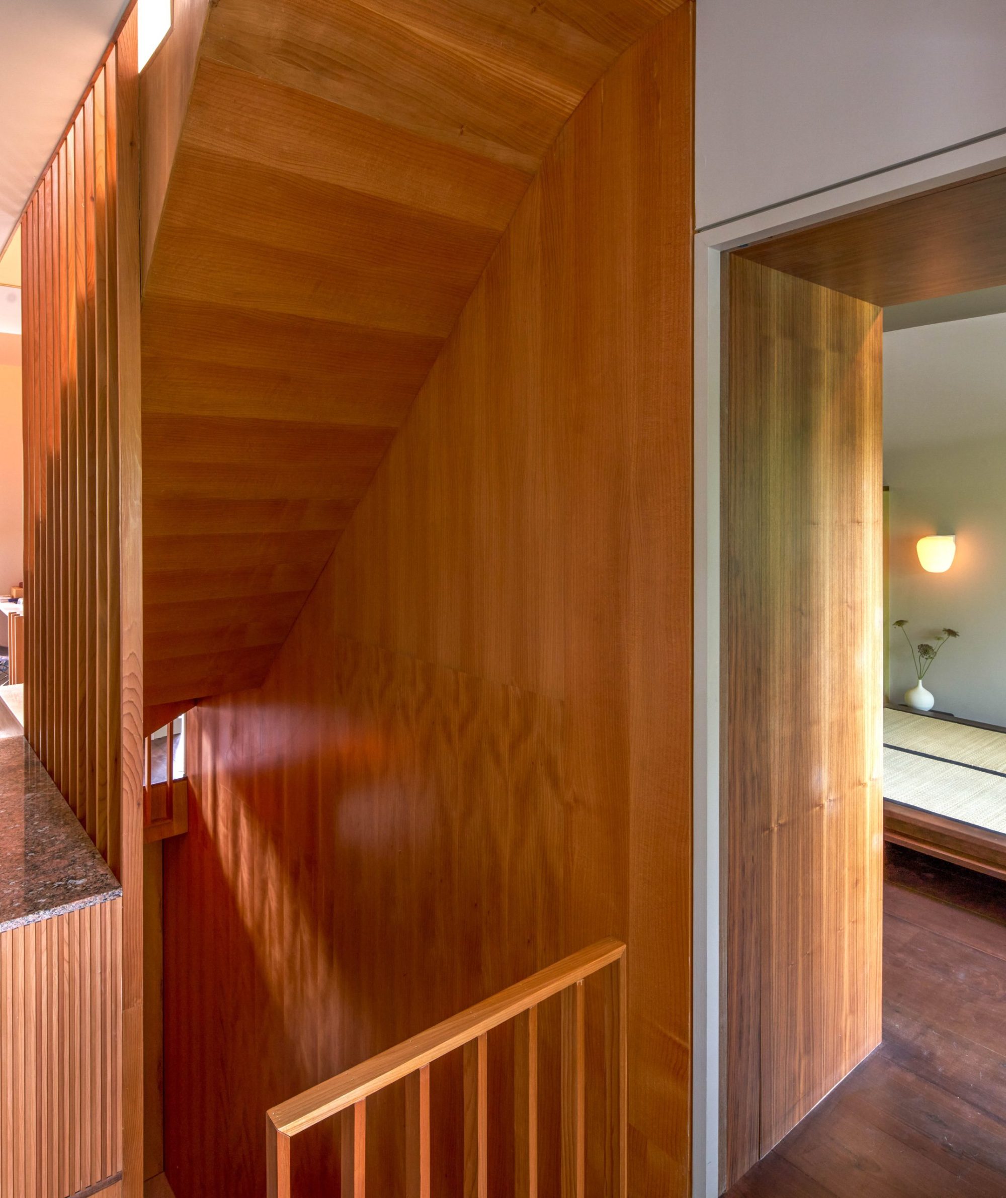
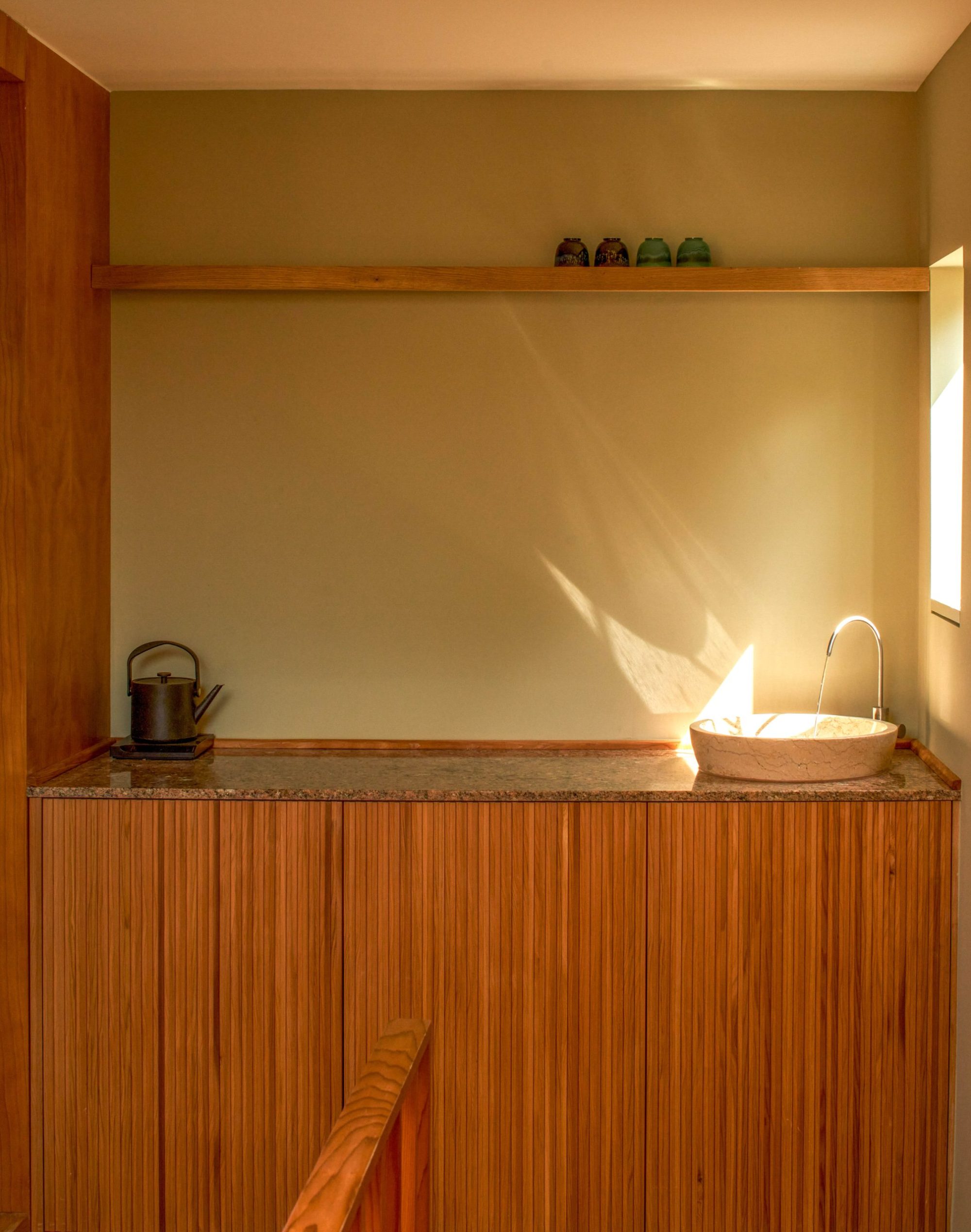
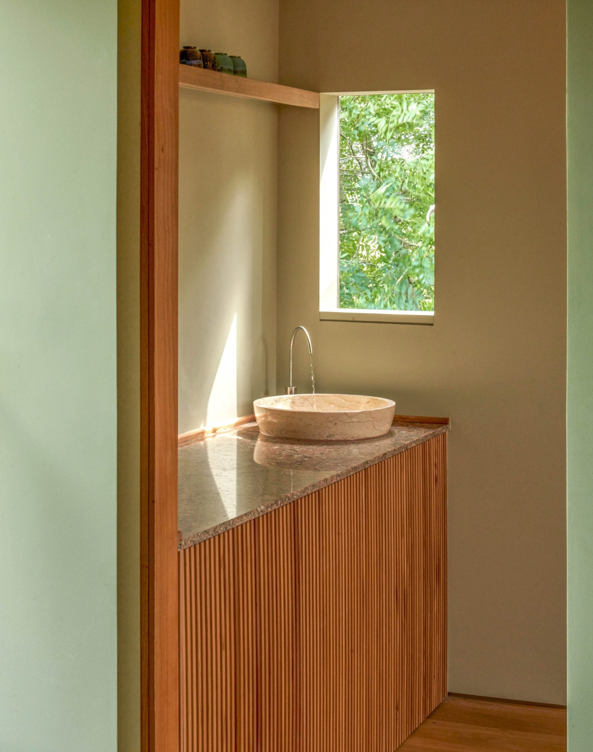
The hallway is key to the transition between levels, but it is also conceived as a ”ma” space, a threshold separating the kitchen from the more relaxed spaces of the dining room and the snug. The terracotta floor differentiates the space from the black, poured concrete floors in the kitchen and other areas and the walls are clad in Lebanese cedar, chosen for its golden hue.
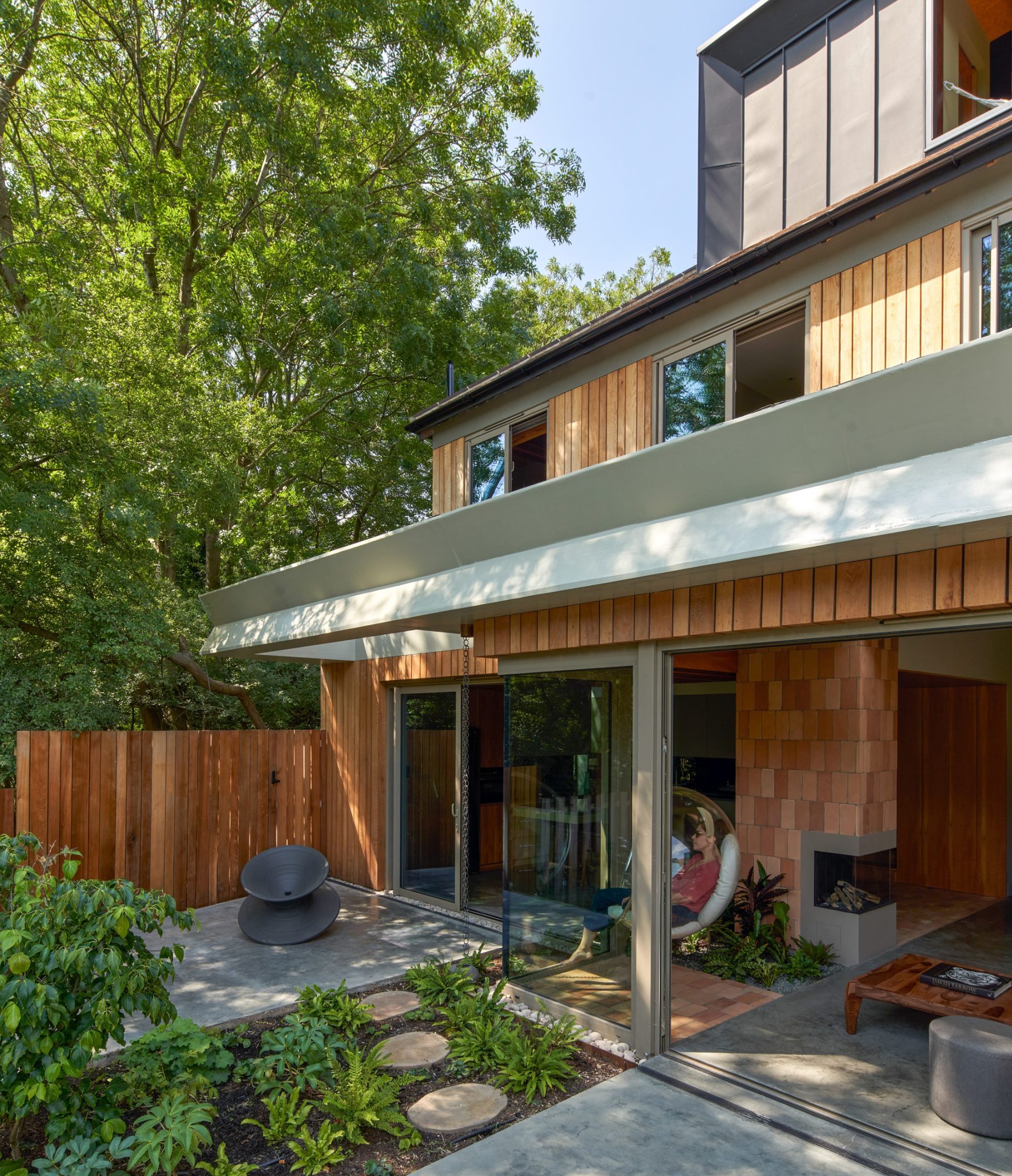
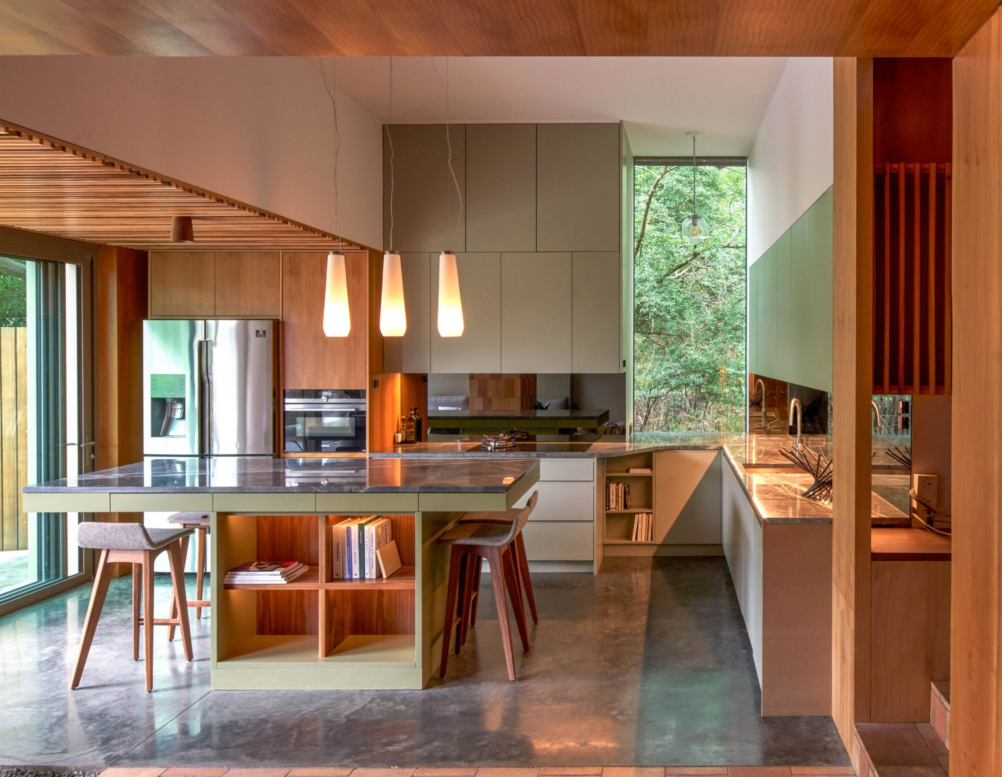
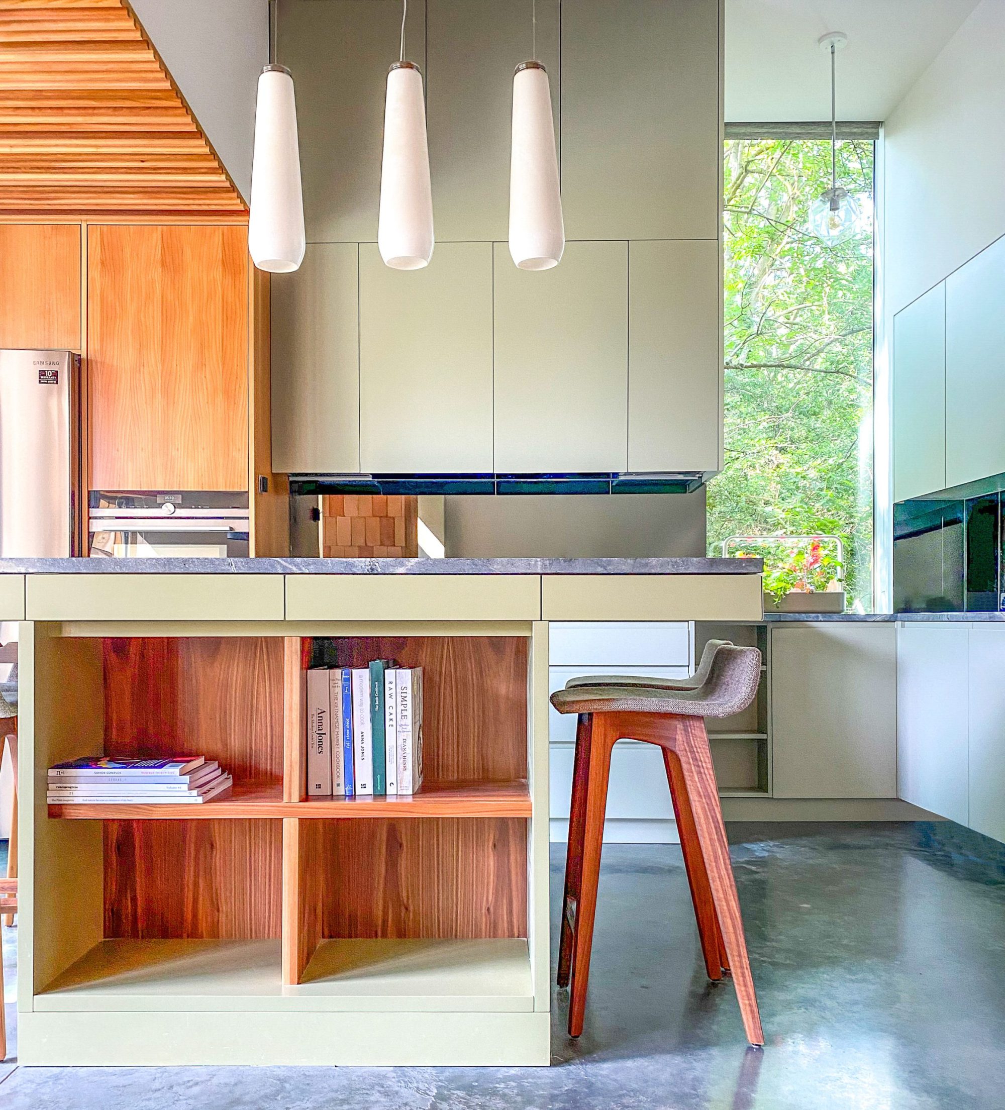
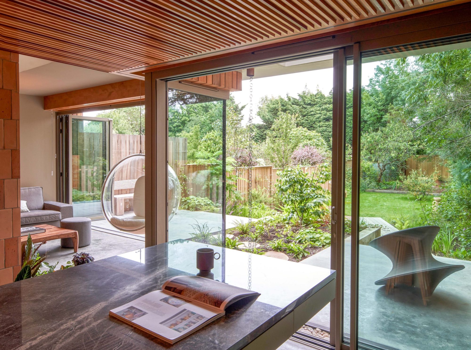
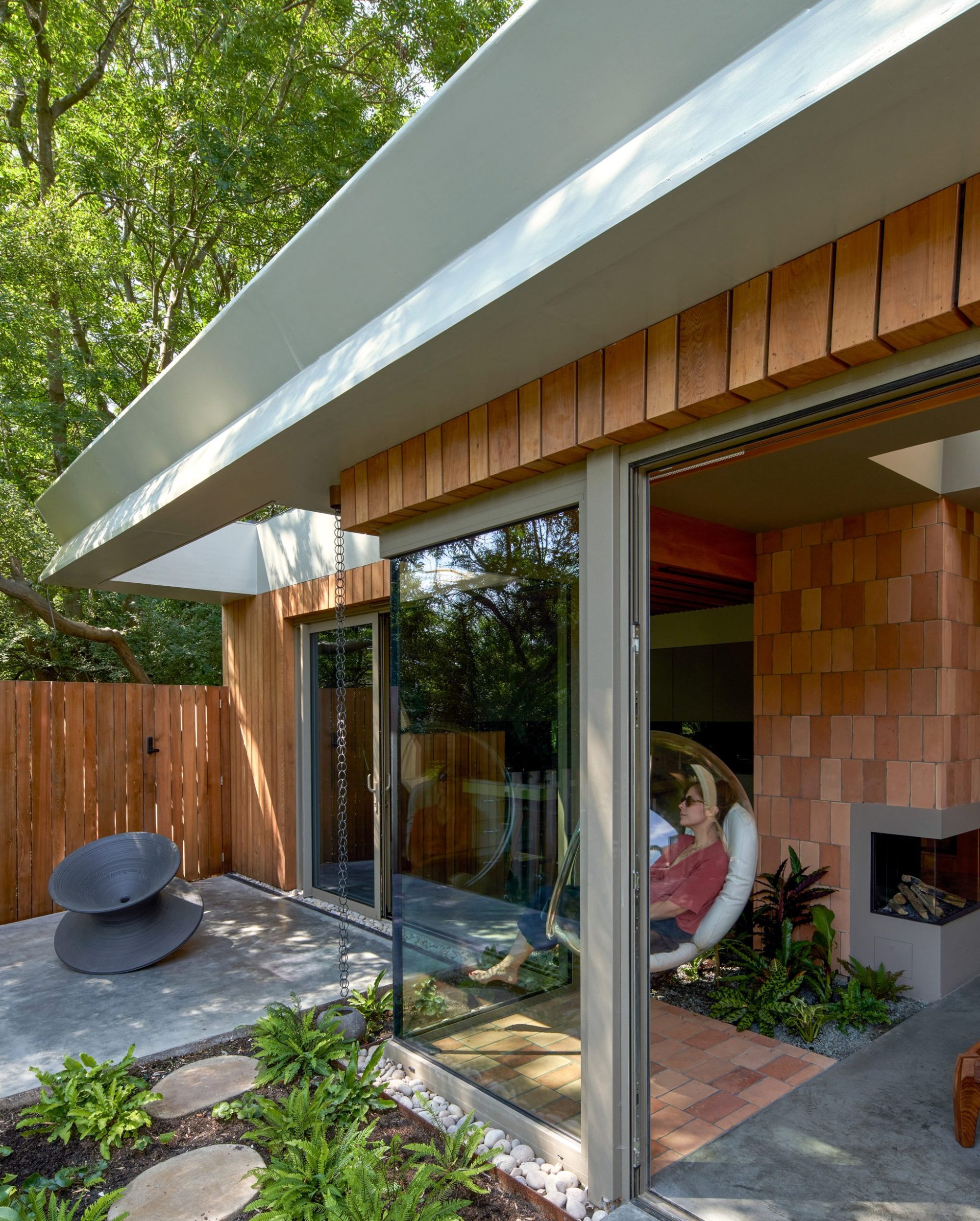
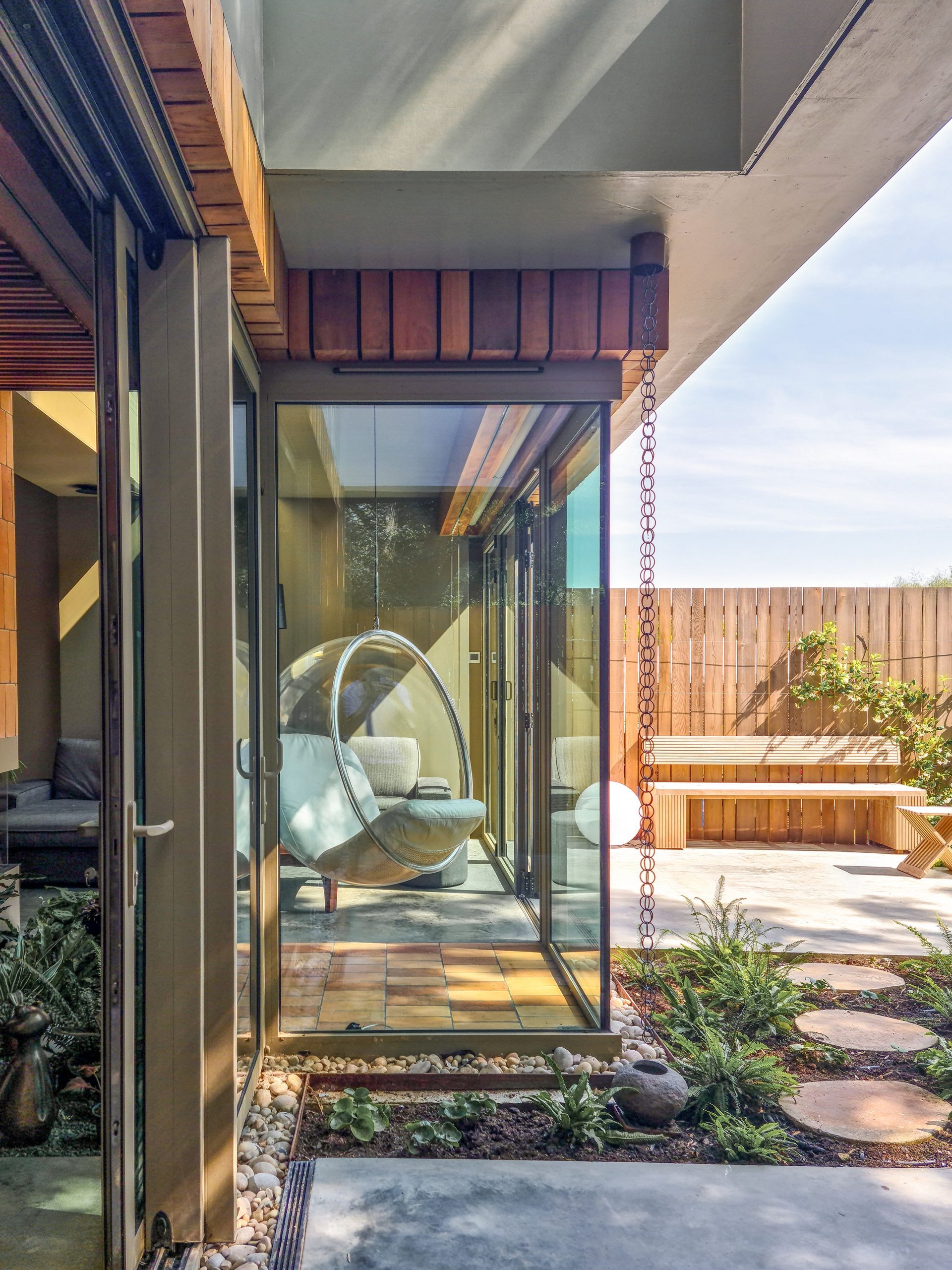
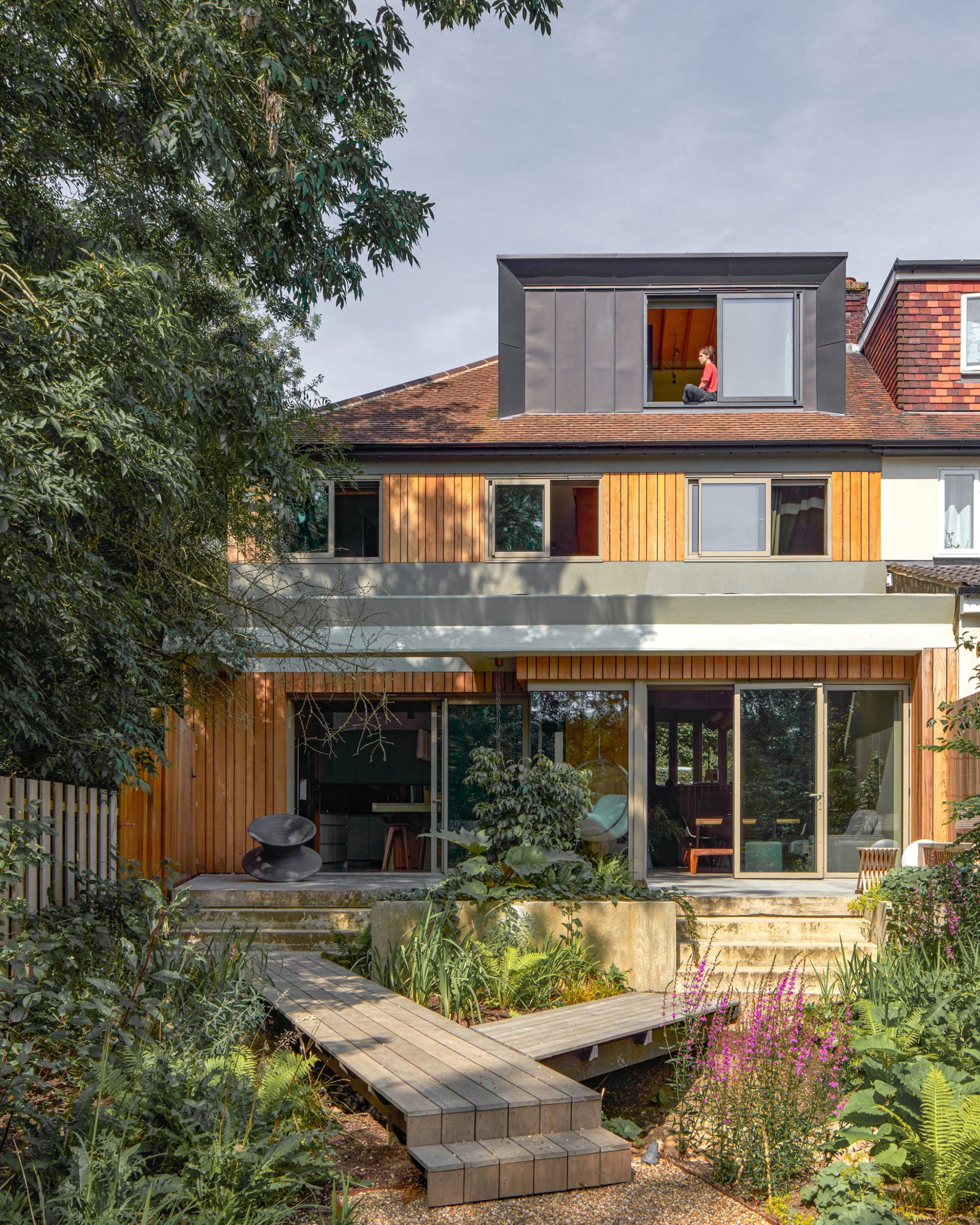
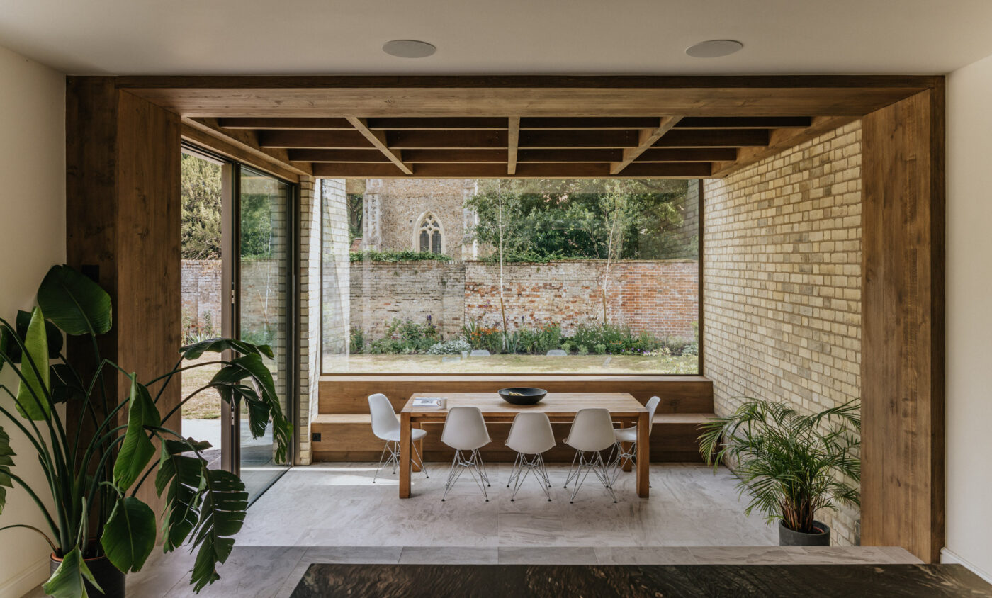
Other materials on the ground floor also have strong materiality, with black coloured poured concrete floor, polished lava stone worktops and brick pamment cladding. The ground floor has been designed to welcome in as much light as possible. The façade facing the garden is completely glazed at ground level allowing a sweeping vista out to the garden and for the garden to flow into the living spaces. An original curved bay window in the formal sitting room on the north side of the house has been retained and smaller spaces have been given new openings with a square bay window above a study space and the snug is capped by a large opening skylight. There is a similar opening externally allowing dappled light from the park side trees to enter the house.
The wild quality of the field of Hawthorn trees beyond the rear garden inspired the collaboration between Neil Dusheiko Architects and landscape designer, Jane Brockbank. The garden is a natural valley that collects runoff from adjacent fields – this wetland condition has been realised as an opportunity to incorporate a planted swale and lush damp loving shrubs and perennials. Timber boardwalks traverse the ground making the entire garden accessible.
To create a harmony between indoor and outdoor spaces a large planter bridges between the two, containing certain plants suited to both scenarios. Additionally, materials are also threaded between the two zones, such as polished concrete flooring and hardwood cladding.
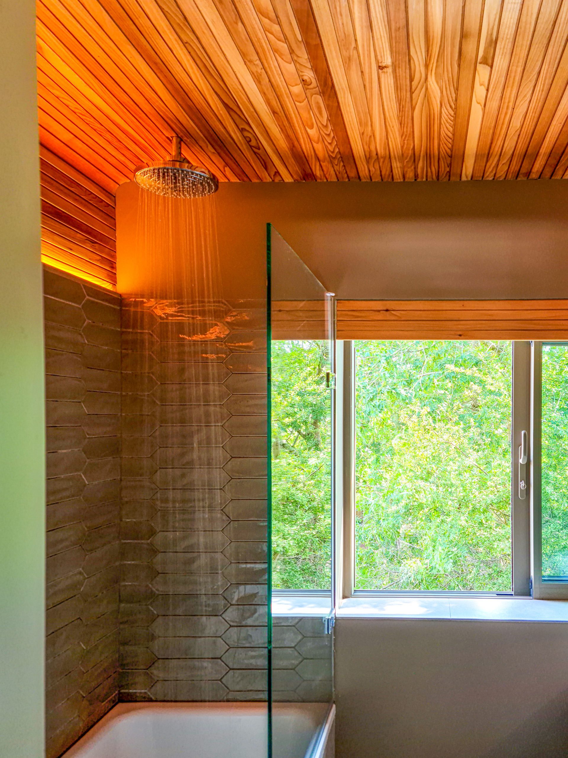
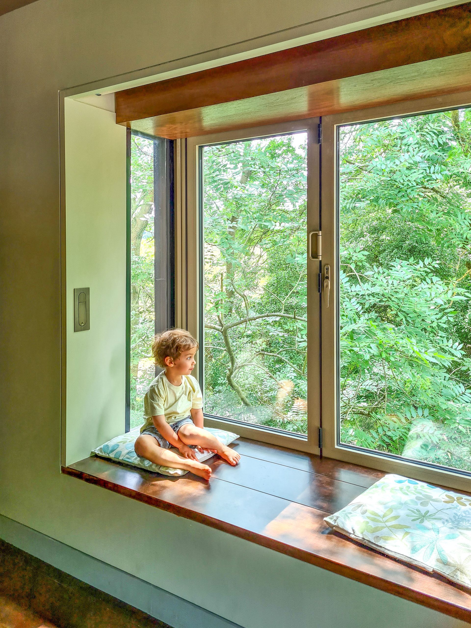
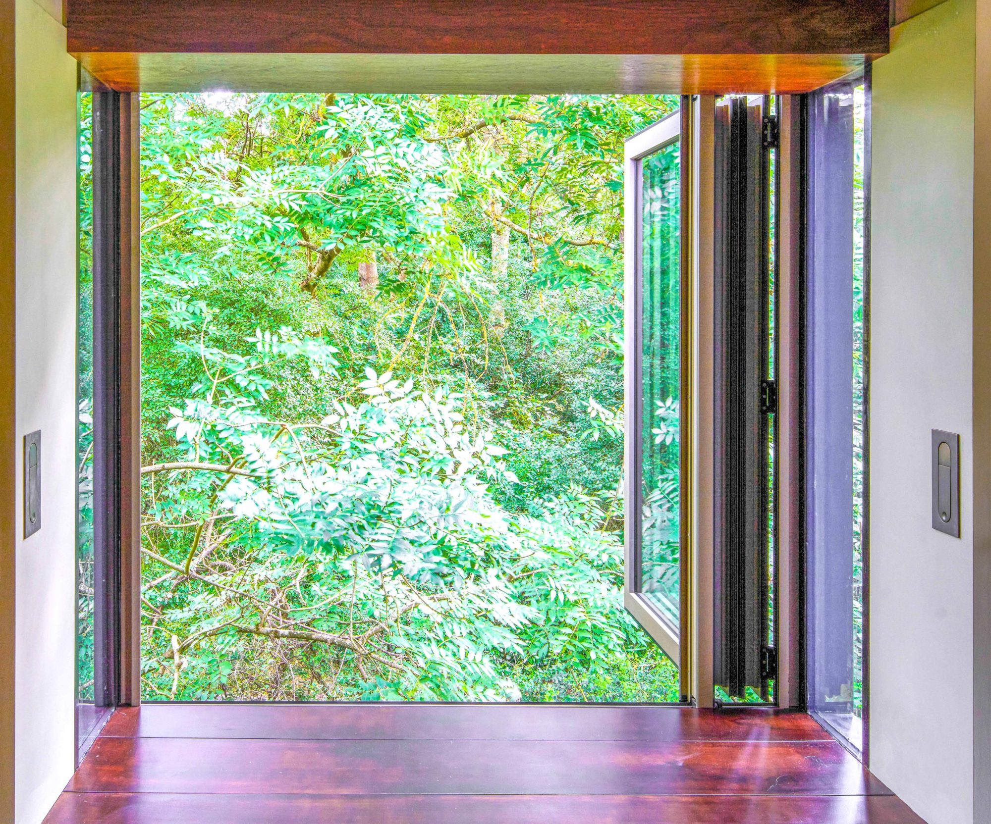
On the first floor, the master bedroom is lined with Brazilian Walnut and includes a secret bathroom entered through a cupboard. There are also two other bedrooms and study spaces for the children. There is also a bathroom with glazing just above shoulder height to allow light in from both sides of the house. A fully glazed oriel window projects out the side of the house, in the middle of the tree canopy forming a peaceful seat to read outside among the branches.
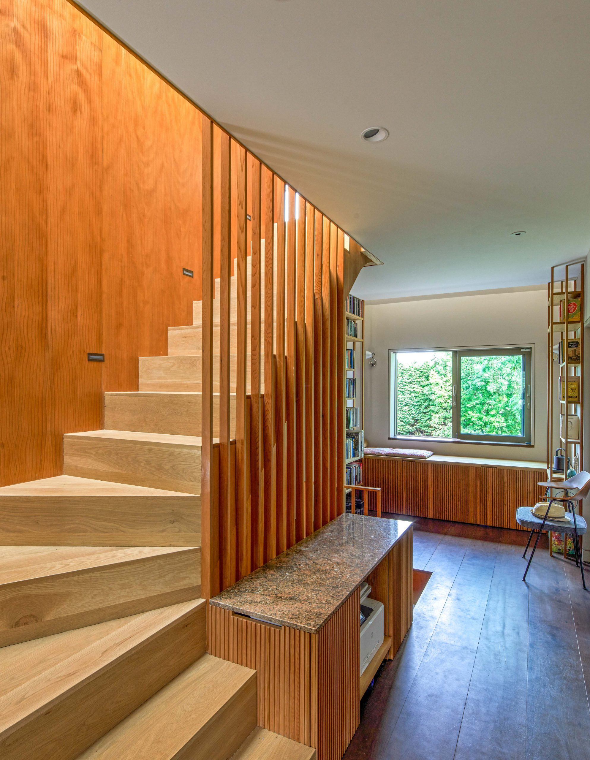
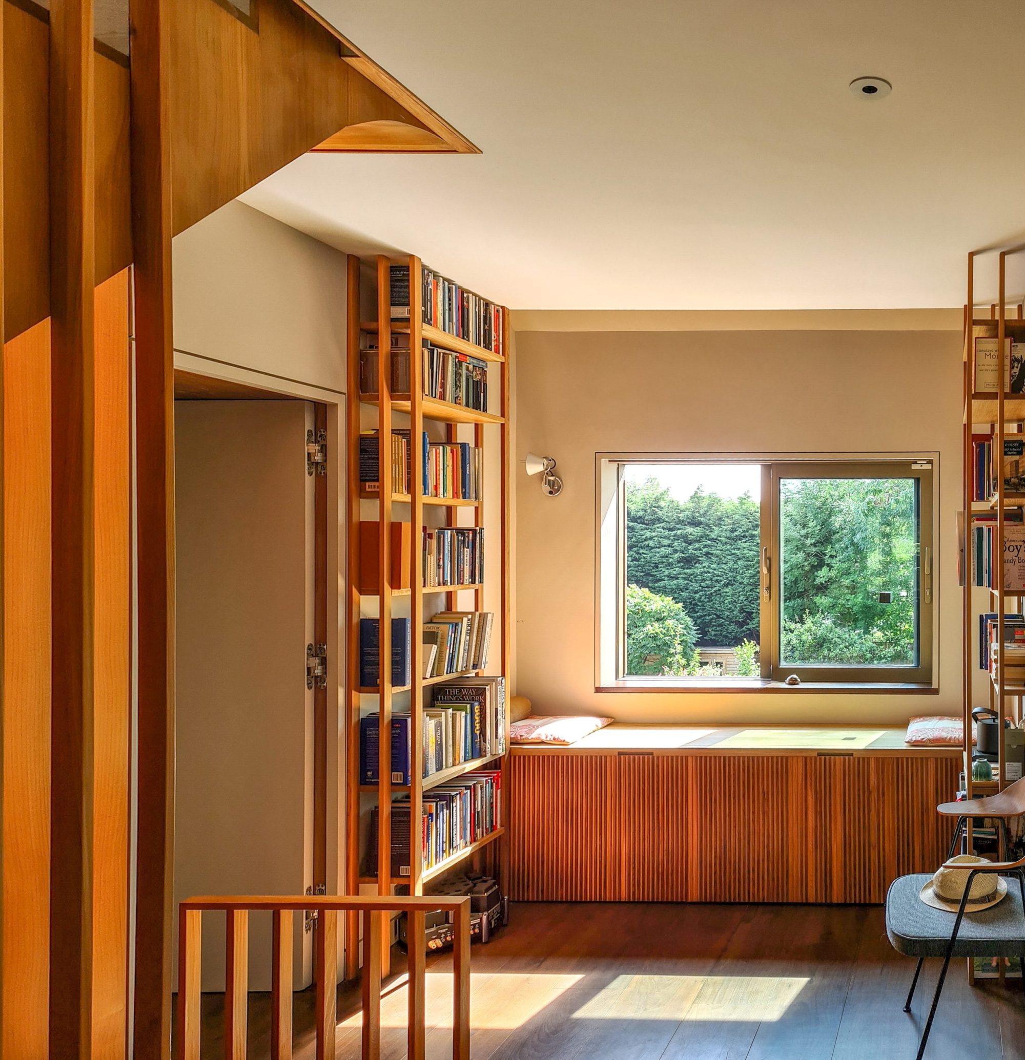
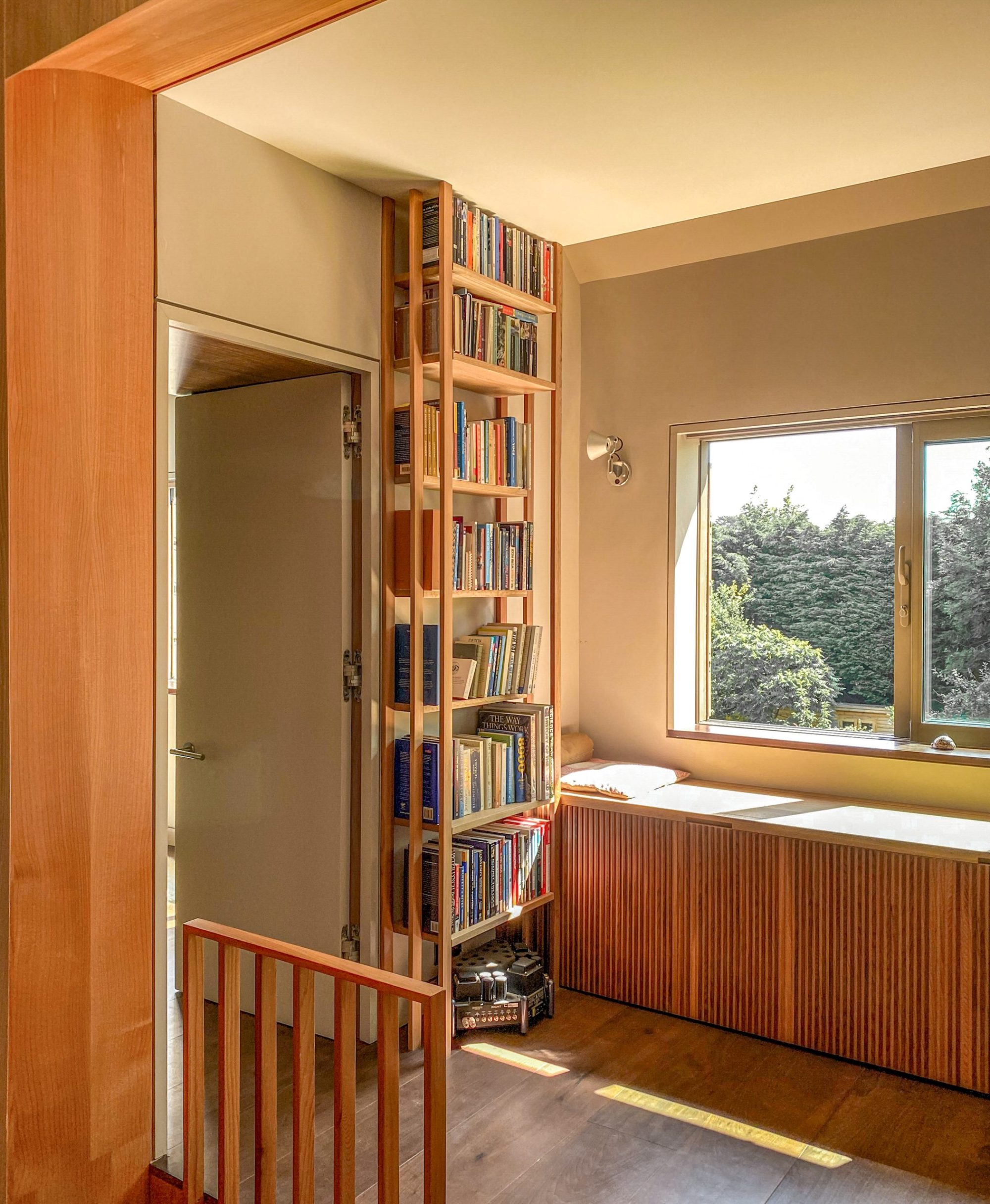
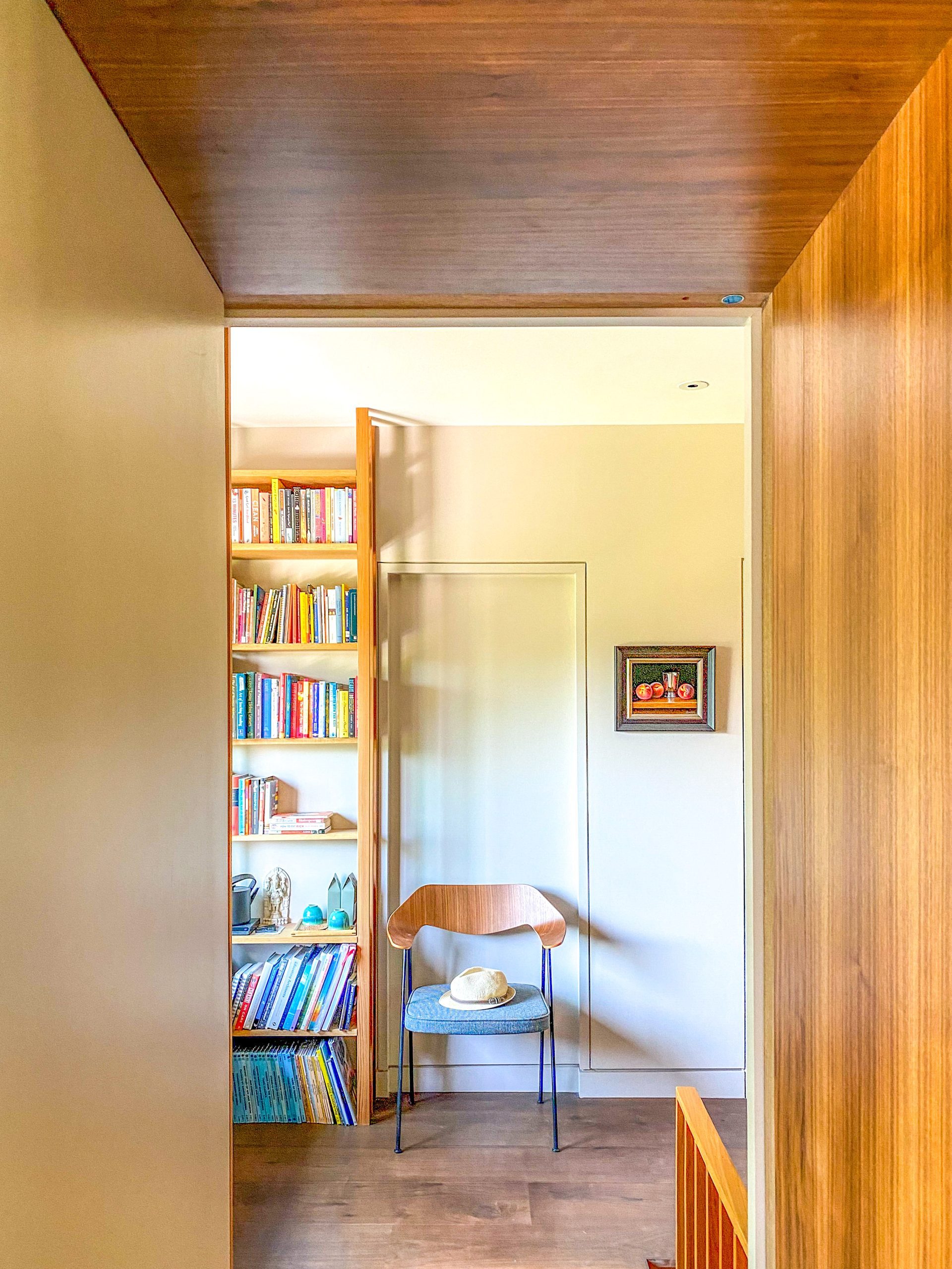
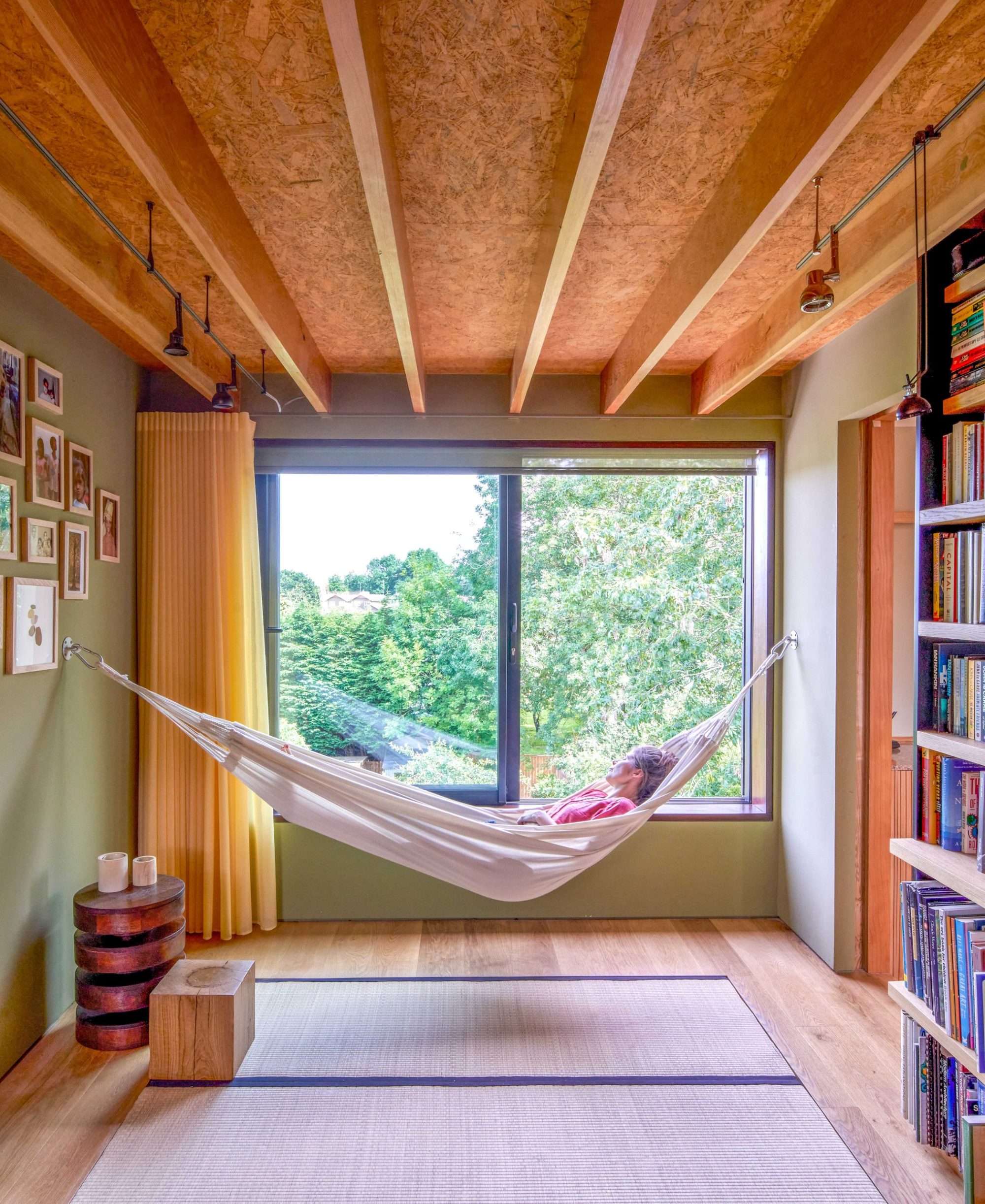
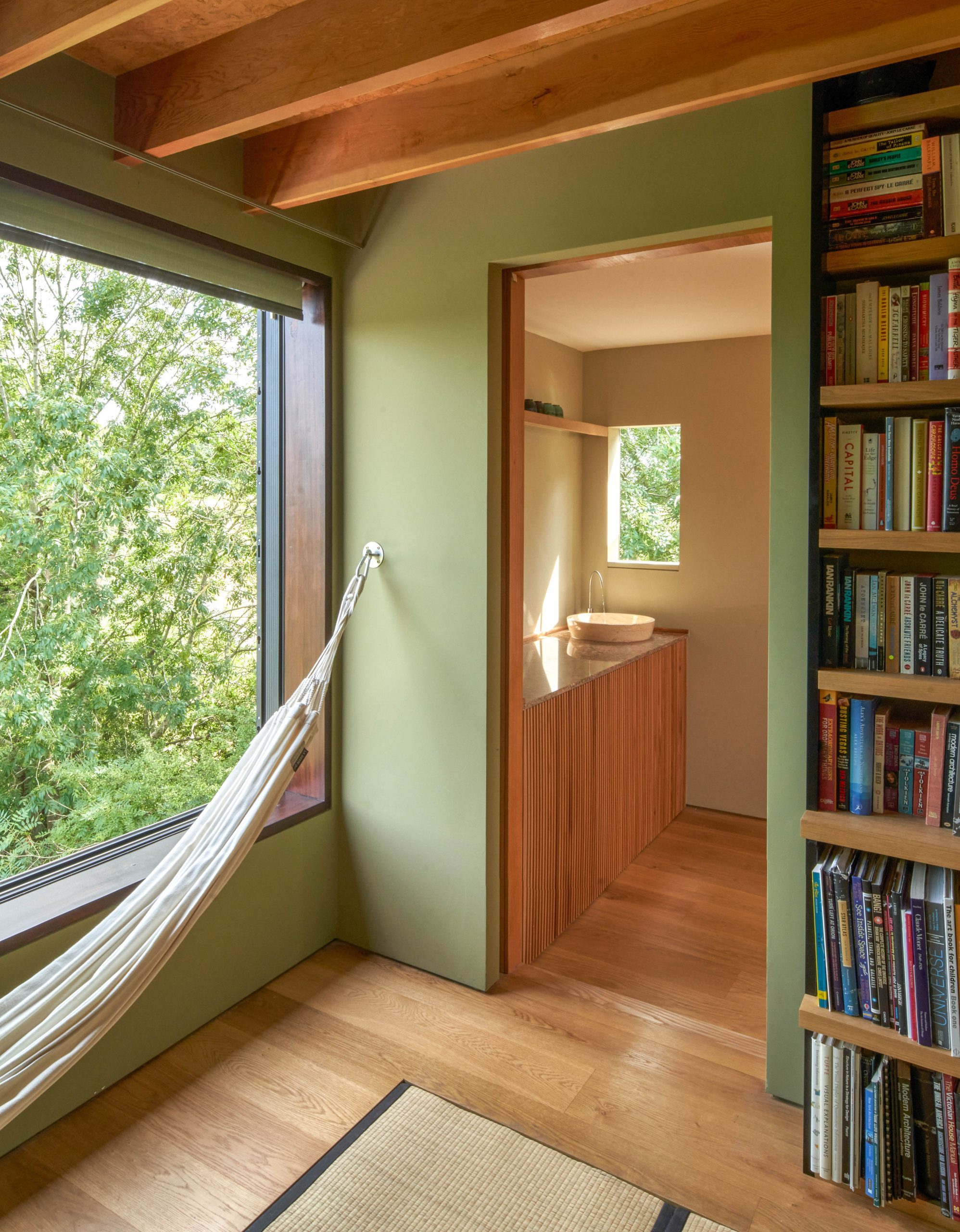
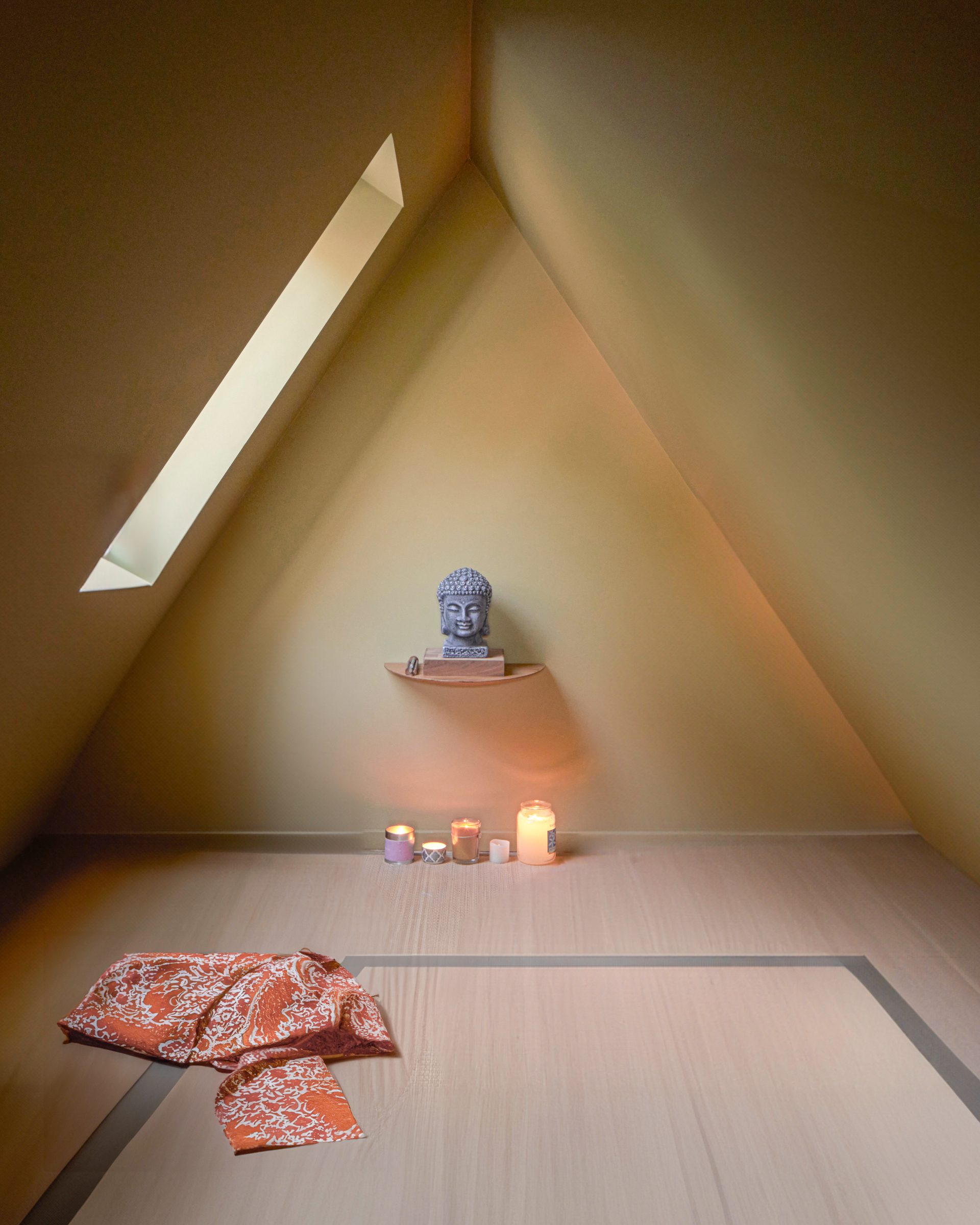
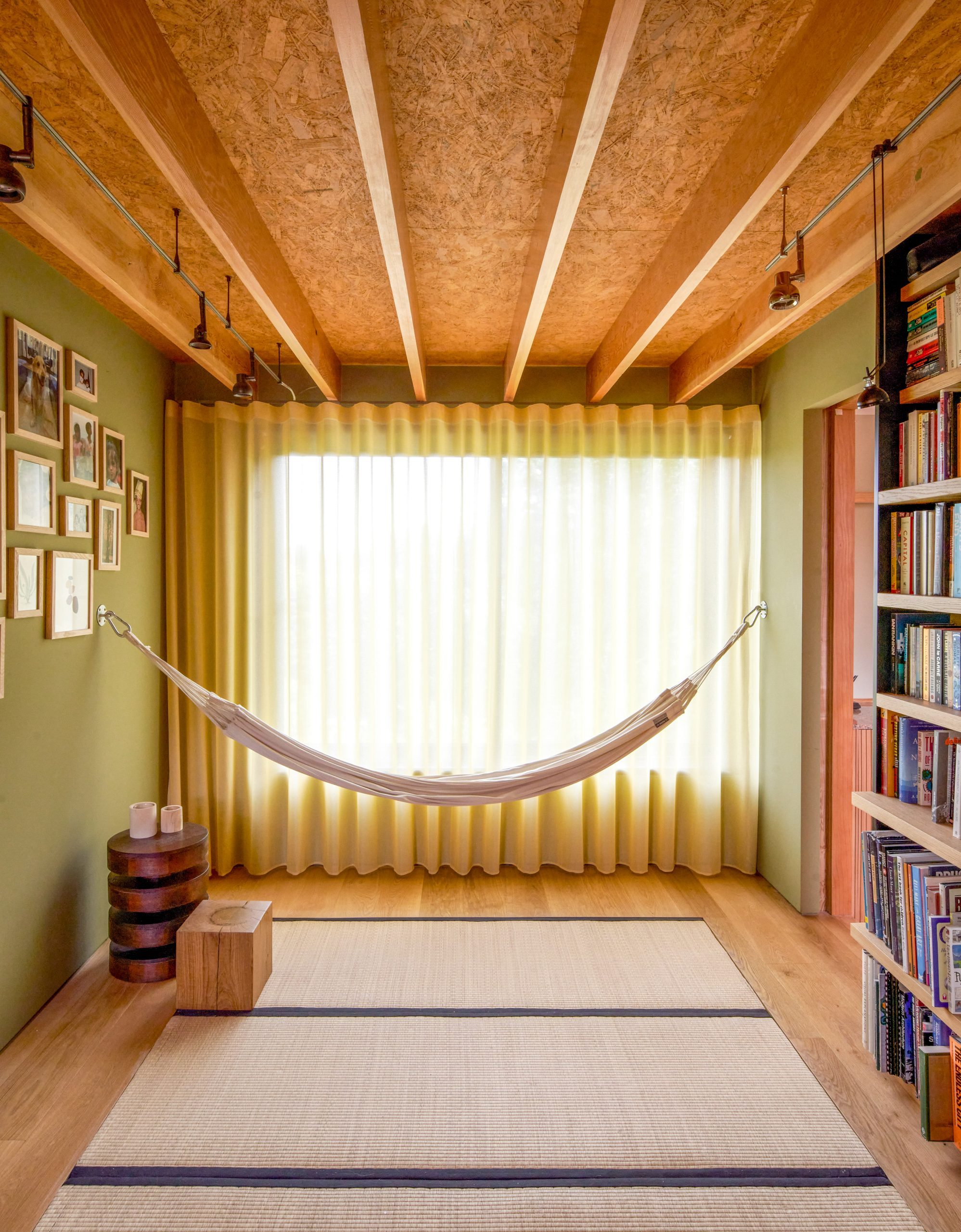
The uppermost floor has a relaxing atmosphere that caters to mind and body with a meditation shrine, gym and library carved into the roof and making full use of all the available spaces. The floor is made of bamboo and tatami mats, continuing the theme of natural materials and heightening the sense of informality.
To make sense of the changes to the topography, we terraced the ground plan of the house into three levels: entry, living, and garden. We then overlaid the key views to the landscape beyond and set about opening up the perimeter to connect to these. At every point where you turn, you connect visually with the outdoors through windows that frame the views in either a landscape or portrait format. Where views are framed in a landscape format – these became points of rest, from an indoor library to an oriel window projecting out among the tree branches.
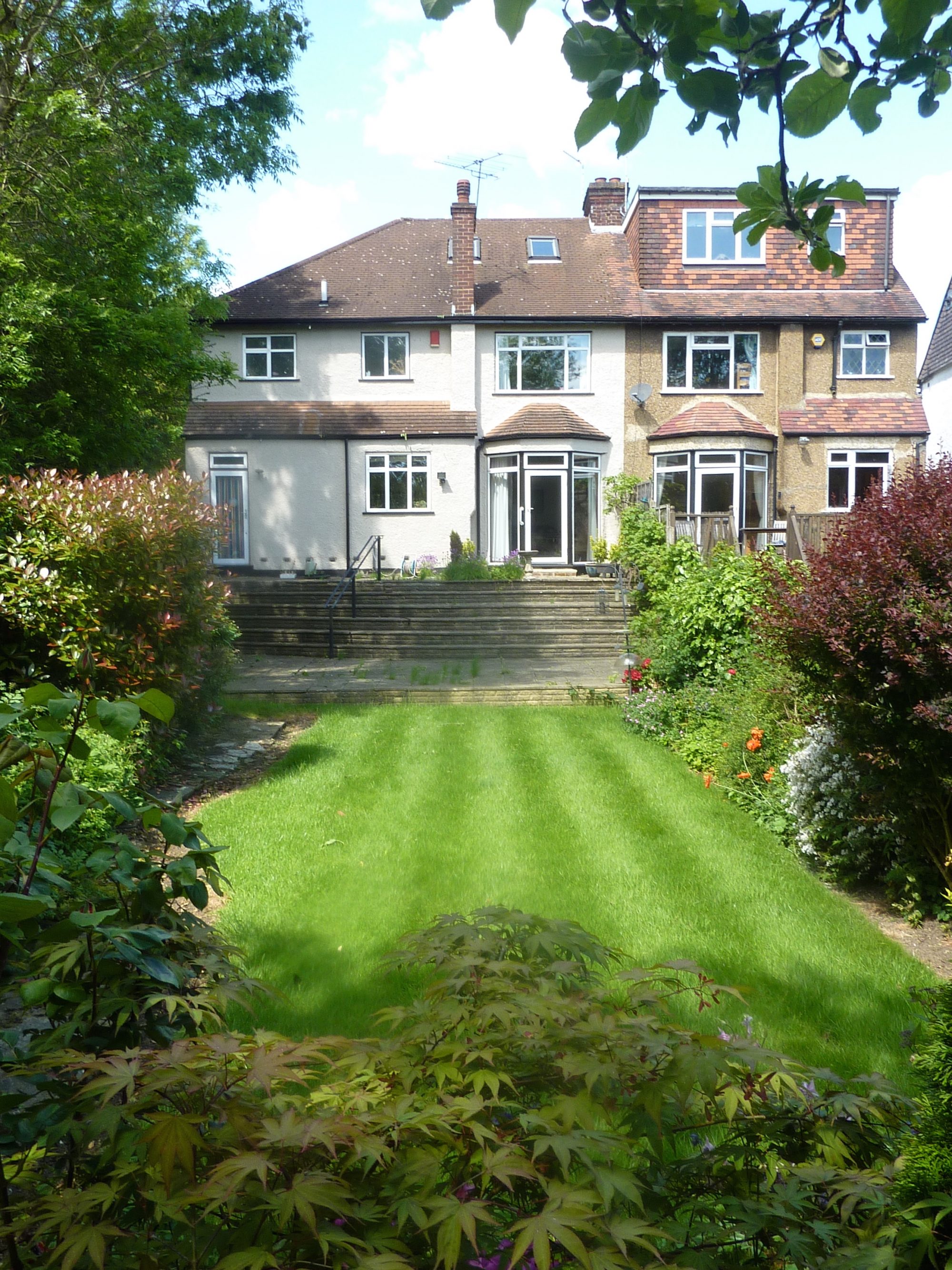
The old pebble dash render is now insulated and clad in cedar, echoing the materiality of the fencing and trees beyond. And our brilliant landscape designer, Jane Brockbank, created a cleverly designed swale to channel away all the excess water.
The double-fronted house was divided up into three bays:
On the ground floor, two of the bays are made of black concrete, flowing out like a lava pier in the garden. Between them is the “ma” space, clad in clay pamments and cedar. Allowing one to reflect on the transition between cooking and eating.
On the first floor, the central bay contains the public spaces of the library and the two study spaces for the children. The top of the house at tree canopy level is dedicated to mind and body, with a gym, library, yoga room, and meditation shrine.
